Jimmy teaches physics and astronomy at Bellaire High School in Houston, Texas. He is certified in physics and computer science and has taught a variety of computer science and science courses in his career. He has a B.S. in physics & astronomy and an M.S.Ed. in physics education. Jimmy is currently a doctoral student in the College of Education at the University of Houston studying computational thinking and computer science pedagogy in physics and astronomy courses.
I created an interactive computer coding activity to help my astronomy students learn Kepler’s 3rd law of planetary motion. I decided to experiment using an actual real data set taken by the NASA Kepler spacecraft
Google Colab is a hybrid of two already highly interactive tools: Google Docs and Jupyter Notebook. Jupyter Notebook is a web-based Python coding environment based on Markdown.
Google Colab takes the interactive and collaborative and cloud-based nature of Google Drive documents and adds the power of Python and Markdown to allow for media-rich content like images and extended writing mixed with live programming code the viewer can run and interact with.
This sort of assignment works quite well for virtual learning although students will likely need lots of useful scaffolding to make the content into something useful.
Google Colab uses Markdown to embed code and rich media
Google Colab Kepler Coding Lab
The idea is to have students using hands-on computational thinking in an open-ended, inquiry-driven activity meant to help student construct new knowledge. This activity invokes all 4 elements in the Computational Thinking in Science and Mathematics taxonomy from Weintrop et al. (2016).
Student group example
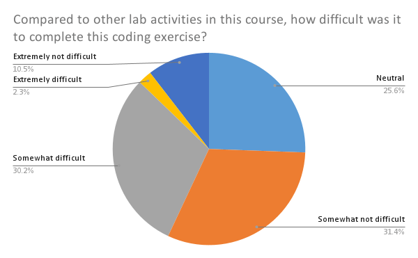
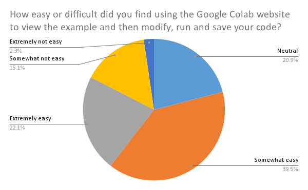
Student Survey and Feedback Results
This was so new and untested that I decided that the last step of this activity would be to complete a very short survey using Microsoft Forms. I used the learning path tool in our district Learning Management System to have the students complete the survey immediately after submitting there group coding. I took the survey data results and created the plots using Google Sheets.
This was an ambitious project for me as a teacher. I want to give authentic science learning experiences that involve computational thinking. But I needed to have some sense of how the project went from the student perspective. The survey gave me some useful feedback.
Students seem to think the tools were mostly easy to use. They also thought, for the most part, that this activity was on par in terms of difficulty with other activities. And the students seemed to enjoy the activity
There are some drawbacks to this activity. It was chaotic and required the computers and the WiFi or ethernet to work correctly. The school district also made the students jump through some hoops to get the code to work. Also, it’s difficult to know how well the group nature of this activity worked.
This activity has led to a research project on assessing student attitudes about computational thinking in my research. Also, I have developed a few more activities like this. Iteratively, I expect the process to get smoother over time.
I would argue that the scaffolding I added using YouTube made this virtual assignment manageable for the students. With an in person version of the activity, the instructor can go from group to group helping as needed. This activity was not only virtual, students didn’t often stick the assigned groups and sometimes just did these kinds of activities on their own.
References
Weintrop, D., Beheshti, E., Horn, M., Orton, K., Jona, K., Trouille, L., & Wilensky, U.. (2016). Defining Computational Thinking for Mathematics and Science Classrooms. Journal of Science Education and Technology, 25(1), 127–147. https://doi.org/10.1007/s10956-015-9581-5
In order to cover the Hertzsprung-Russell diagram with my astronomy classes, I decided to try a live interactive tool as a formative assessment. This was an in person, small-group activity that I piloted in all three of my sections of astronomy. They used laptops to complete the activity.
Google Jamboard is an interactive whiteboard product that allows content to be created synchronously and asynchronously. Students were trying to learn how an HR diagram works by correctly placing the stars on the diagram. This was meant as an inquiry-based way to use peer instruction to learn how to plot stars on the HR diagram.
Results
5th period results6th period results7th period results
There were some bumpy moments, but all three sections managed to end up with more, or less correct implementations of the HR diagram. When one compares the three side-by-side, the results are pretty darn close.
Reflection
This was the first time I tried using a Google Jamboard in this way. Giving up control and letting the students find their way through this was tough at first, but it was fun and instructive. I will admit that at first the free-for-all nature of dragging and resizing the “sticky notes” was a classroom management challenge. But eventually everyone get into the spirit and it was fun and helpful.
This did feel like a peer instruction exercise in knowledge construction and I got to see it first hand. As a formative assessment where students really do have control over the tool, this was a new technique for me personally. My gut tells me that in a virtual environment, the lack of student interaction with one another in a whole-class setting would make this activity problematic. If students were in small groups and synchronously working virtually, this activity might work. The lack of immediate feedback to help with classroom management seems likely to cause this activity to become a wild jumbled mess very quickly.
I am having to explain computational thinking all the time. My chapter 1 deals heavily with CT so I decided to create a mind map to show the levels and connections
Tool Selected
I decided to use GitMind because it was one of the least irritating. Most tools for this purpose seem keen on trying to upsell in the most irritating EdTech way possible. GitMind sounded like GitHub which I like so…. tried that one.
Challenges Faced and Overcome
I needed to take a very hierarchical taxonomy and create a nice flow and some useful connections. The tool was web-based and easy enough to use. This sort of thing isn’t all that challenging as far as tech tools go. Just irritating in an EdTech sense. I like the no-nonsense Audrey Watters take on EdTech.
Recommendations
This was the most painless tool I could find for mind mapping. I honestly think white boards or chalk paint on table tops are a better way to do this sort of visual thinking. But this one was not painful to use.
Reflection
I personally like analog solutions for this sort of visual thinking. Mind mapping is not a technique I thoroughly enjoy. In fact, I have some reservations about the theoretical underpinnings of mind mapping as knowledge creation. That being said, this was a moderately useful task to perform. And I have a nice graphic to use if needed.
This infographic is meant to show visually how the computational thinking in math and science taxonomy created by Weintrop et al. (2016) might look. The infographic is something I might use in a poster or a talk or a paper.
What did you learn that was new to you? Please be specific about the skills and knowledge you learned in this adventure.
I learned how to use the hierarchical structure of the SmartArt interface to get just the look and feel I wanted for my CTMS infographic.
How will you use these skills in your teaching?
Adding new tools to presentation skills is always helpful for an educator. This sort of infographic is a common thing to see and now I can make my own.
What questions do you still have about this content?
I wonder about the extensibility of the API from PPT to other tools like Google Slides, Canva, GIMP, etc.
Where will you go from here? How will you get there?
The next thing might be to learn some more professional infographic production skills using something like the Adobe suite of products. I am familiar with InDesign and Photoshop. Those tools might lead to more polished graphics.
I was invited to give a 15-minute talk at the CSTA CS Across the Curriculum Summit. This slide presentation is a modified version of that talk meant to demonstrate what I learned in the week 4 module about creating effective presentations.
What did I learn?
I create and give a lot of presentations. Going through the various talks and sets of tips and tricks helped me sharpen some of my skills. One thing I learned is to reduce text. And once I’ve done that, I should do it again.
Reflections
The need for a presentation to have the full breadth of web-enabled technologies is essential in our modern academic world. Viewers of content correctly expect interactivity, brevity, clarity, and connectivity. In this modified slide deck, I tried to give useful links, reduced text, and useful images.
To produce the plots, I used the Python implementation of Seaborn in a Google Colab Notebook. The data came from my own published version of the SCS1 concept inventor by Parker, Guzdial, and Engleman. I took the data from Qualtrics and reduced it a bit in SPSS by IBM. Next, I put the reduced data into a comma-separated values file (CSV). Then I wrote some Python code to load the data into pandas dataframe which is a very handy container that allows for complex data analysis techniques. Seaborn is cited quite often in literature and is easily one of the most popular data science packages in use today. I would be remiss if I didn’t also mention that Seaborn used the wildly successful matplotlib graphics package in Python.
For the infographic itself, I used one of the infographic templates inside Canva. The tool itself was fairly easy to use. I’ve worked with desktop publishing software in many forms and Canva is a very helpful web-based graphics application
Some other visualizations I created in python are below.
basics subscale vs arrays subscale as kernel density estimateboxplot of arrays, basics, and logical operator subscales
I decided to make a 2-minute screencast about how to add data labels to a chart or plot using Google Sheets. The original activity was to create a Hertzsprung-Russell diagram using stellar parameter data collected from Stellarium. You can actually see me explain this lab last year during the pandemic virtual school year. Doing this lab in person was A LOT better.
Which screen capture or screencast tool did you use?
I created both the screencast about adding data labels and also the lab explanation from last year using Screenflow for Mac. Screencasts have been a part of my teaching tool kit since they started. That means it is worth it for me to pay for a professional program like Screencast. There are more serious screencast packages available but Screenflow hits all the right notes for me.
Once I exported the video, I posted it to my YouTube channel under the astronomy playlist. I have used other video streaming solutions in the past but until the state of the industry shifts, I am going to stick with YouTube.
Did you find the tool easy or difficult to use, or somewhere in between?
The learning curve for Screenflow is rather like learning any graphics editing package. There are some interesting shifts when you are creating videos and adding annotations. The online forum for Screenflow is helpful and often people make screencasts of how to do certain things in Screenflow. Nice.
Who is the audience for this type of material?
Although this is meant for my high school students, this might be useful for anyone wanting to add data labels in Google Sheets.
Do you think that screen capture/screencasting is a technology tool you will continue to use?
I have been using screencasting for a long time and I will keep using it for a long time. It was indispensable during the pandemic.
Do you have experience using any other screen capture or screencasting software before this week?
Although I’ve used a lot of packages before, I hadn’t ever used the ending and opening titles nor added the exact type of annotations I added here.
Is there anything else you would like to add about this topic or about your work this week?
All educators need to become comfortable with screencasting.
What type of microphone or recording device did you use to record your audio narration?
Logitech BRIO Webcam with integrated microphone
How do you think the audio turned out?
This is the same camera I’ve been using for virtual presentations and for online teaching. It is easy to use and produces great quality audio and video.
What problems, if any, did you experience while recording your narration?
The audio needed to be in MP3 format for use in Google Slides rather than the newer MP4 format. I used VLC to convert.
If you had problems, were you able to solve them, either partially or totally? If so, how did you solve the problem(s)?
Having experience with tools like this, I knew that I could easily convert from one audio format to another. Easy enough!
Did you use PowerPoint to record your audio narration? If so: